J’N’C
Magazine
Redesign 2011
Logotype, editorial design, consulting & corporate design, website
2011
Since 2004
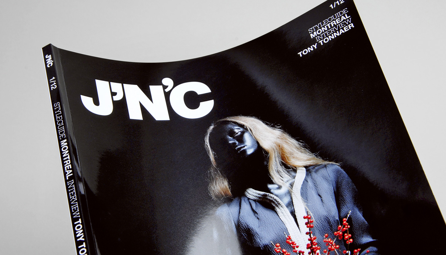
We took J’N’C Magazine another step further. After the first redesign in 2004, we changed the logotype and title concept in 2009, followed by another redesign of the 01/2012 issue.
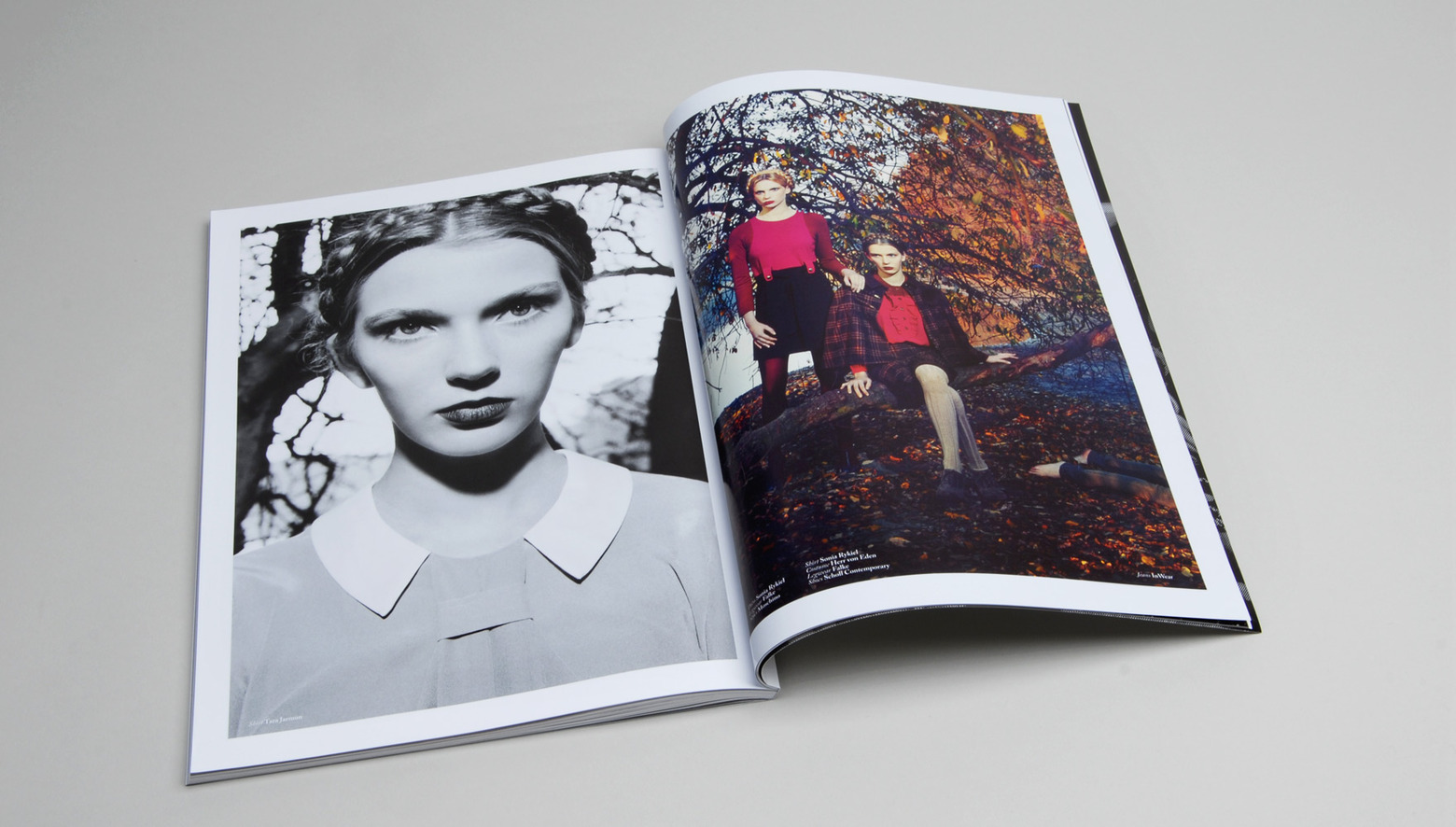
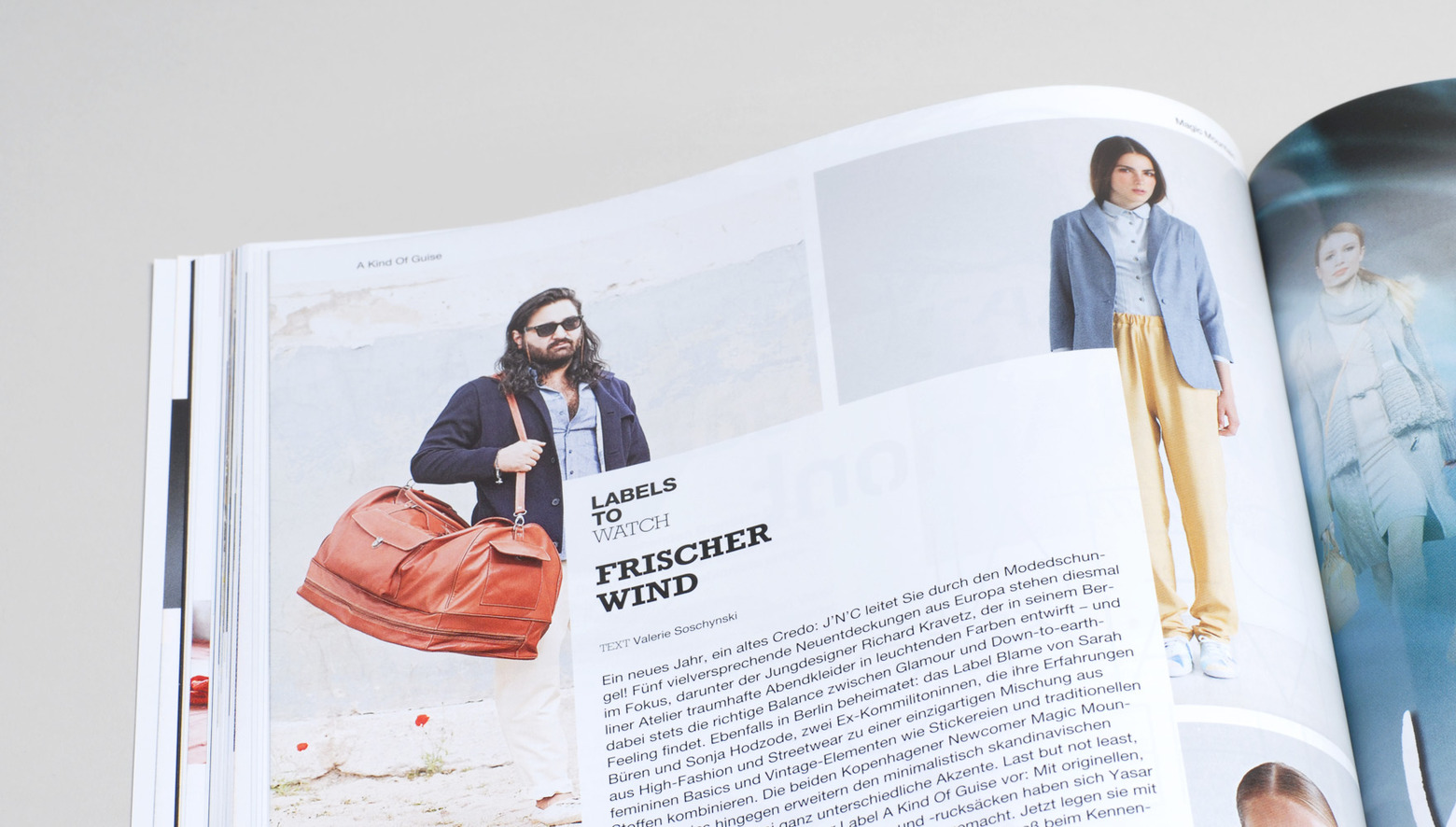
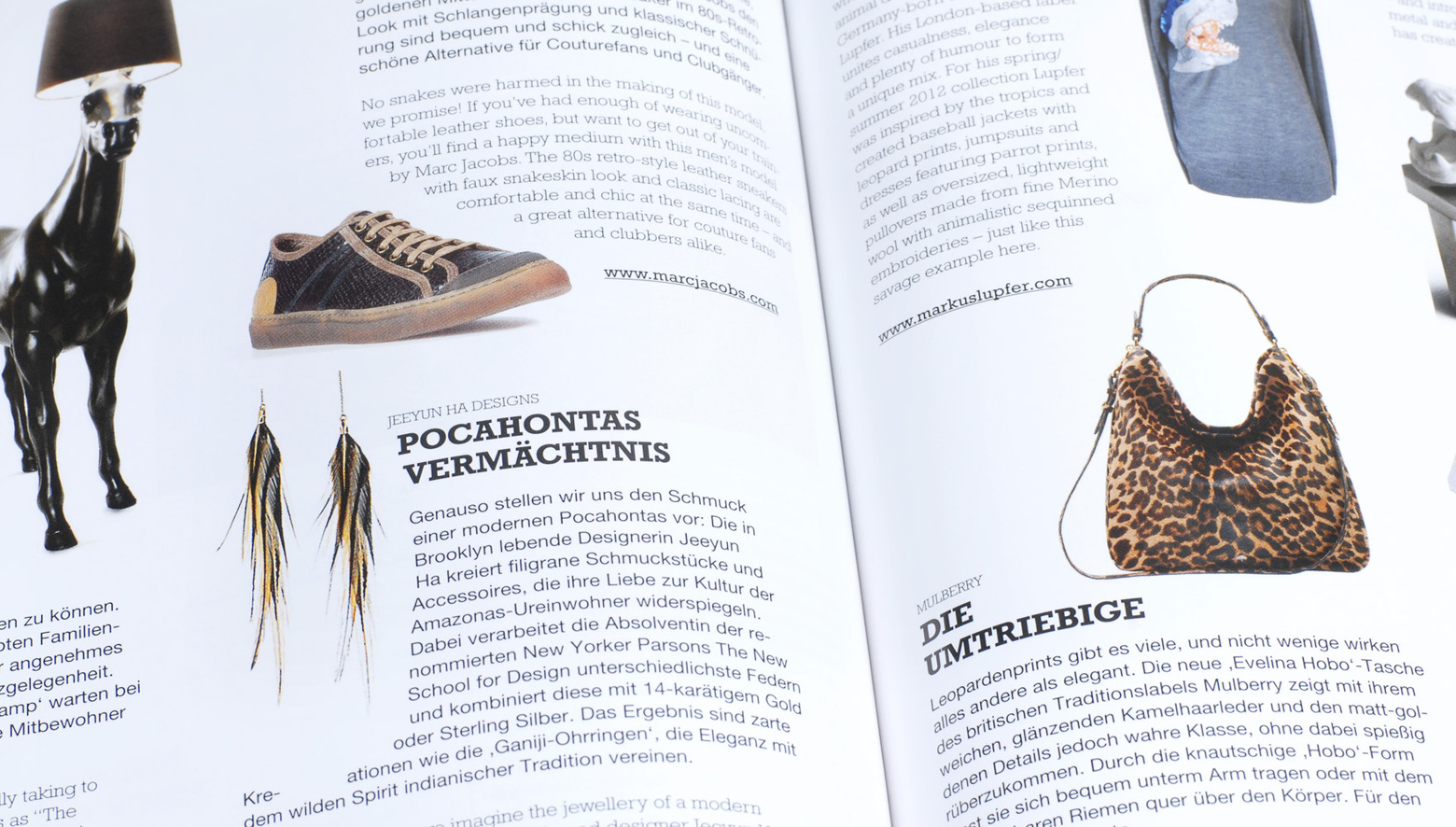
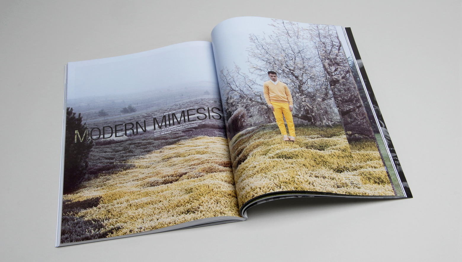
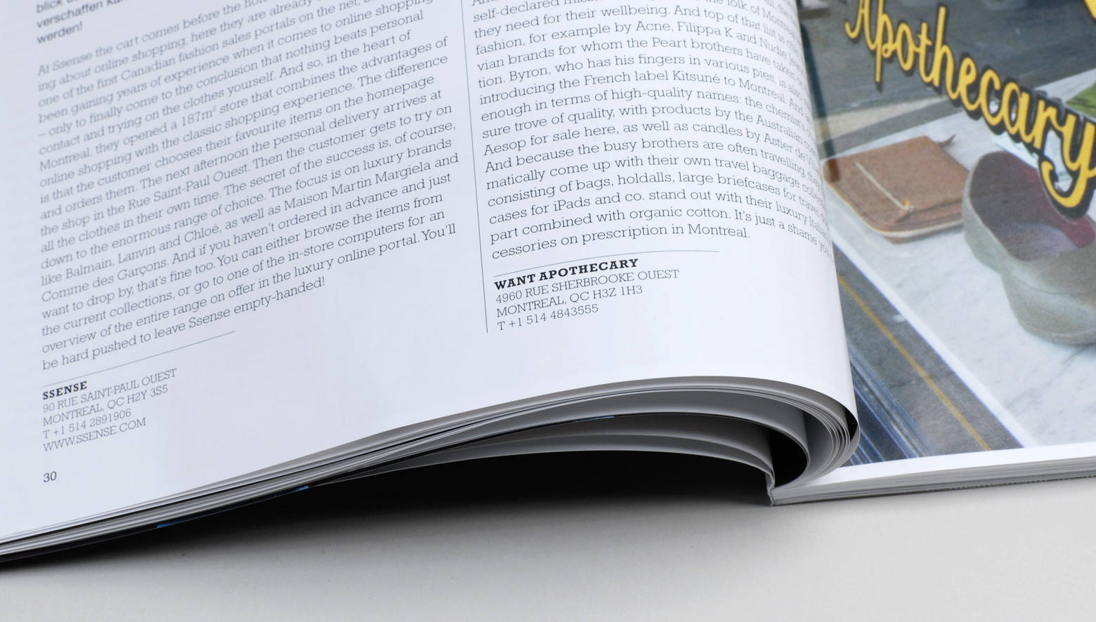
The format has been changed to DIN A4; the overall layout grid has been redesigned and adapted to new ambitious contents requirements of the editorial staff.
